We "Kick Alz in the Ballz" with our Hilarity for Charity website redesign.
Overview
Website: www.hilarityforcharity.org
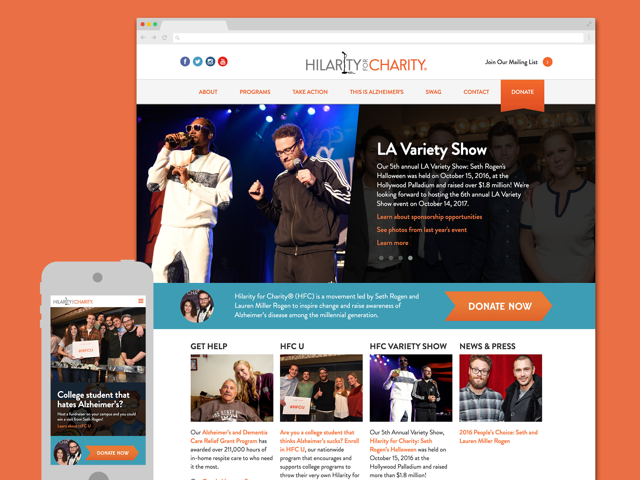
Hilarity for Charity, the movement led by actor Seth Rogen and Lauren Miller Rogen to inspire change and raise awareness of Alzheimer’s disease among the millennial generation, was looking for a redesign of their out-of-date website. When they asked us to help them out and rethink their entire online experience, we couldn’t say no to this great project and cause.

Stage 1 – Discover
We sat down with the Hilarity for Charity team and learned all about their mission, ideas, and overall goals for the new site. Aside from redesigning and developing a new website, and finding ways to communicate & highlight their many initiatives & programs, they wanted to look fun and whimsical to better reflect their founders and their brand. What better way to truly battle the horrors and sadness of Alzheimer’s than comedy?
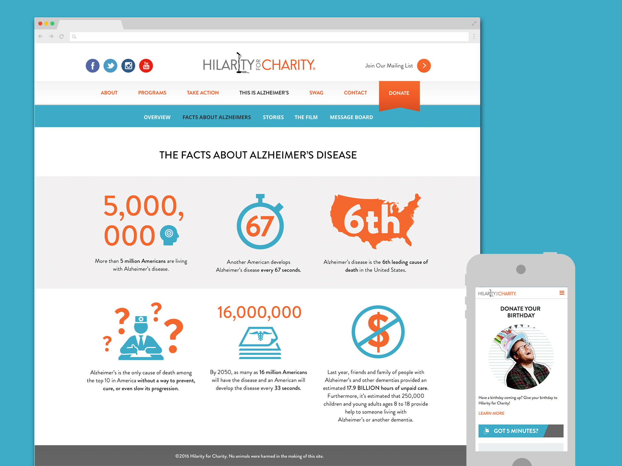
We took this to heart as we began to wire frame out the site, finding ways to showcase their amazing event photos and their celebrity cache amid prominent calls to action and donation. We set aside sections for personal stories, for ways to get involved, and for event previews and updates so their audience would always be in the know. Throughout the process, we worked closely with the team to ensure that they were on board with our ideas and that the process continued smoothly.
Stage 2 – Empower
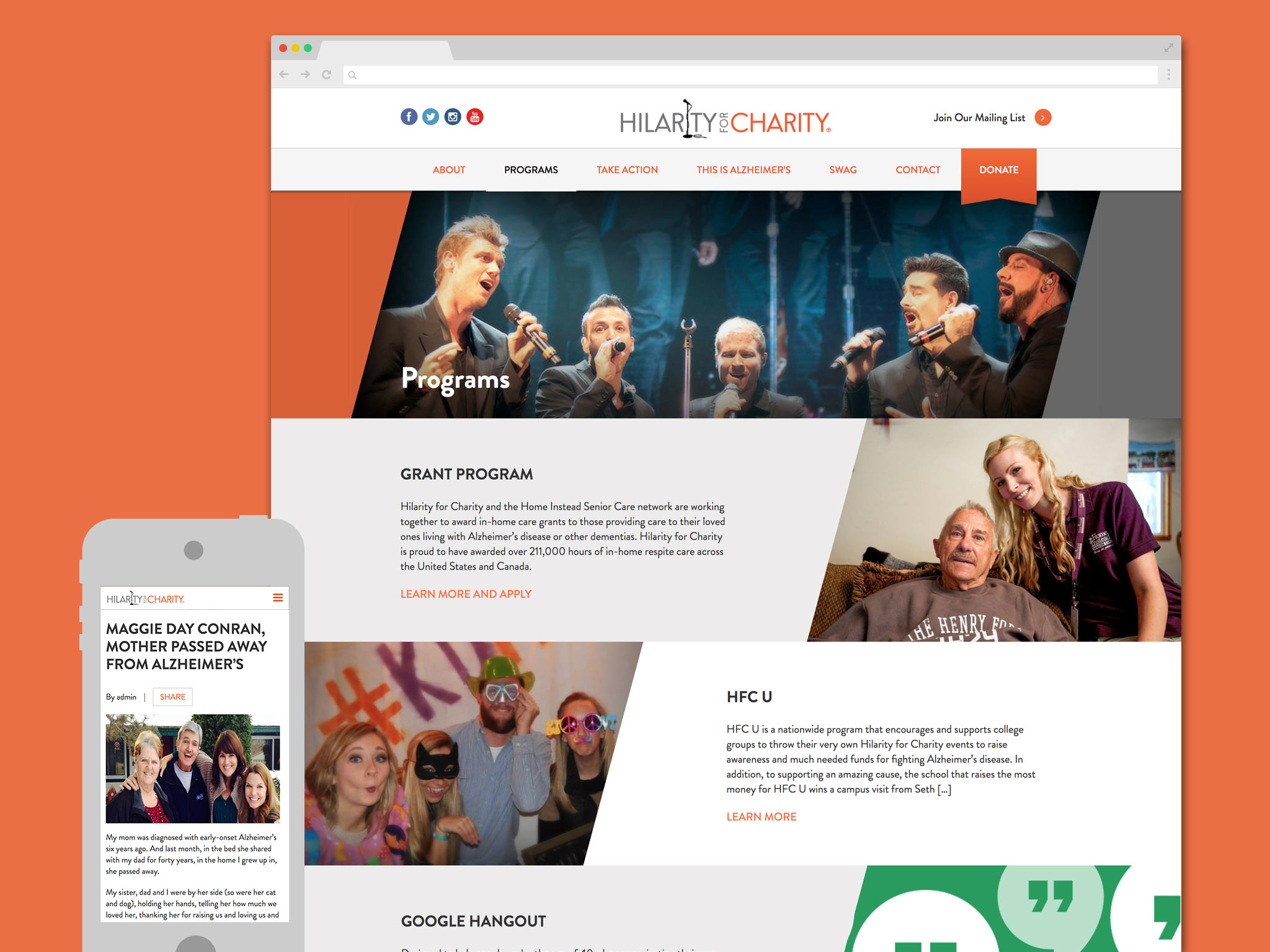
With approved wireframes, we kicked off our visual design stage, choosing appropriate colors, fonts, and imagery that flushed out our functional layouts. We looked for ways to create elements of fun and whimsy that would attract a younger target demographic and reflect the spirit of the Hilarity for Charity brand, like the diagonal orange and grey bands of color and photographic choices focusing on the celebrities and energy powering the cause.
Stage 3 – Engage
With final designs approved, we undertook the development of the full site, making sure it was responsive across all devices and up to current browser standards. The redesigned site launched in mid 2016, giving the organization the visual and functional change they’d been hoping for. Promotions and events were more visible AND easier to update with through our WordPress content management system, and donations and calls to action gave users greater access to help and get active .
We continue to support Hilarity for Charity and their website as they continue their mission to put an end to Alzheimer’s!


